Squirrel City Jewelers
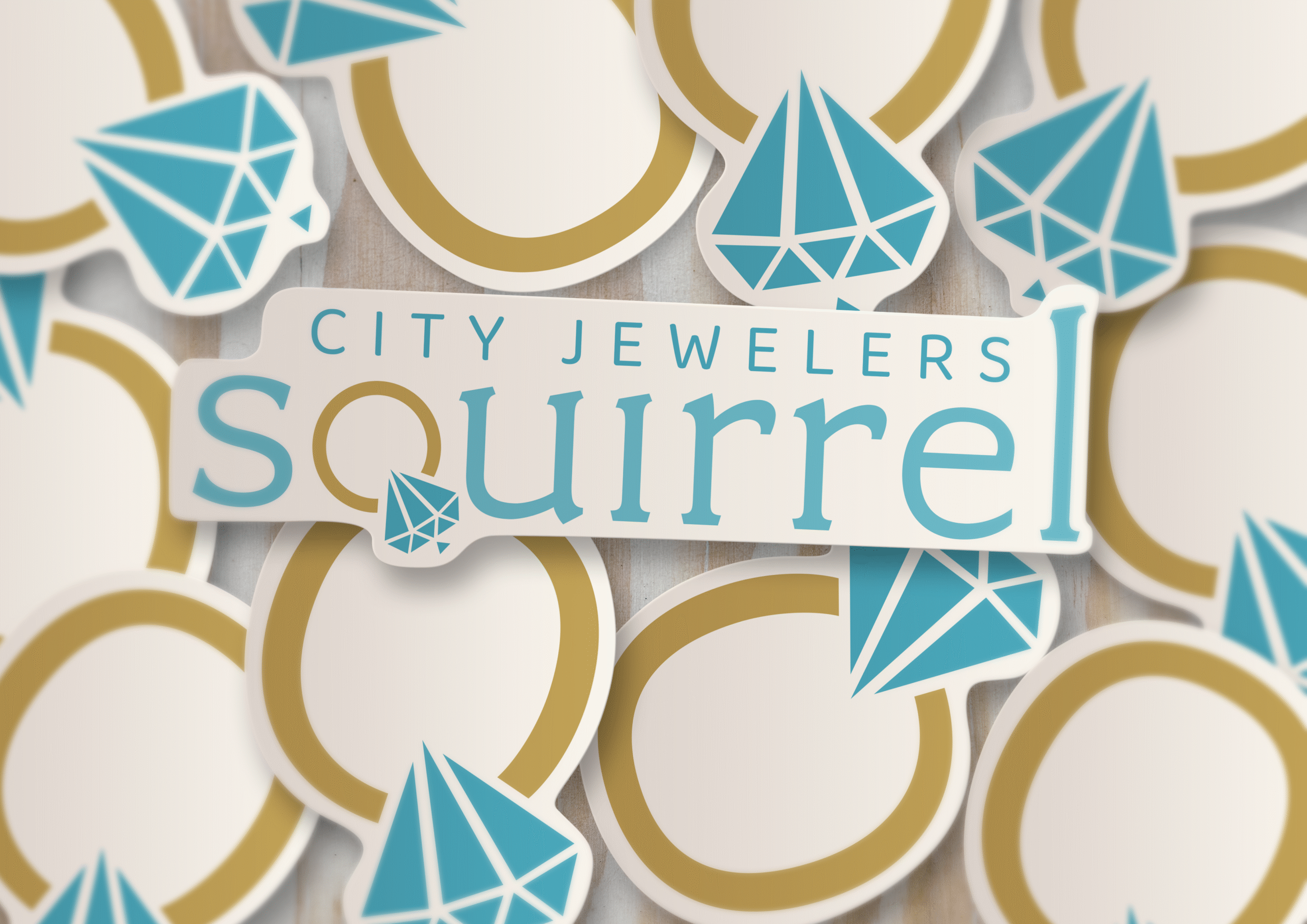
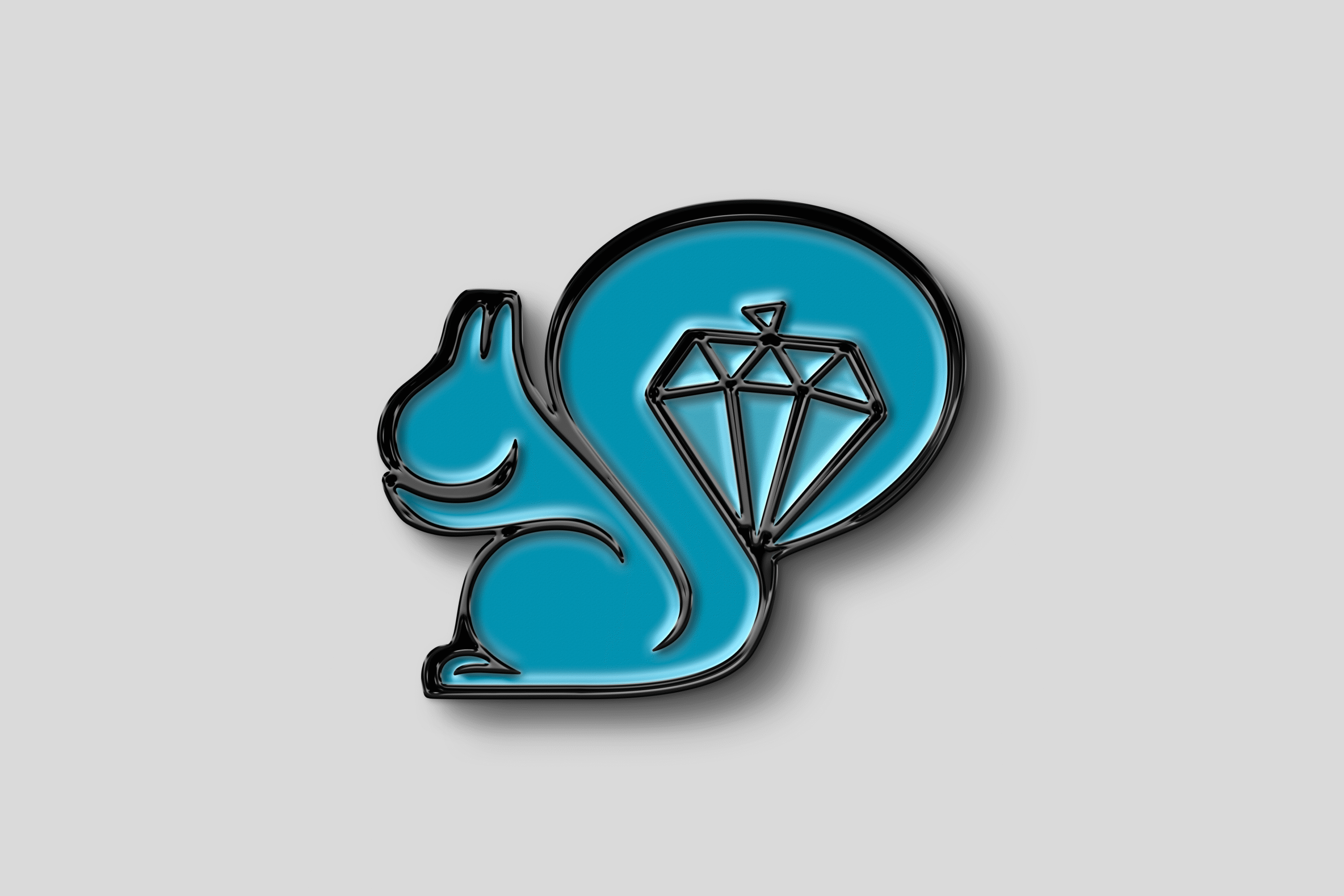
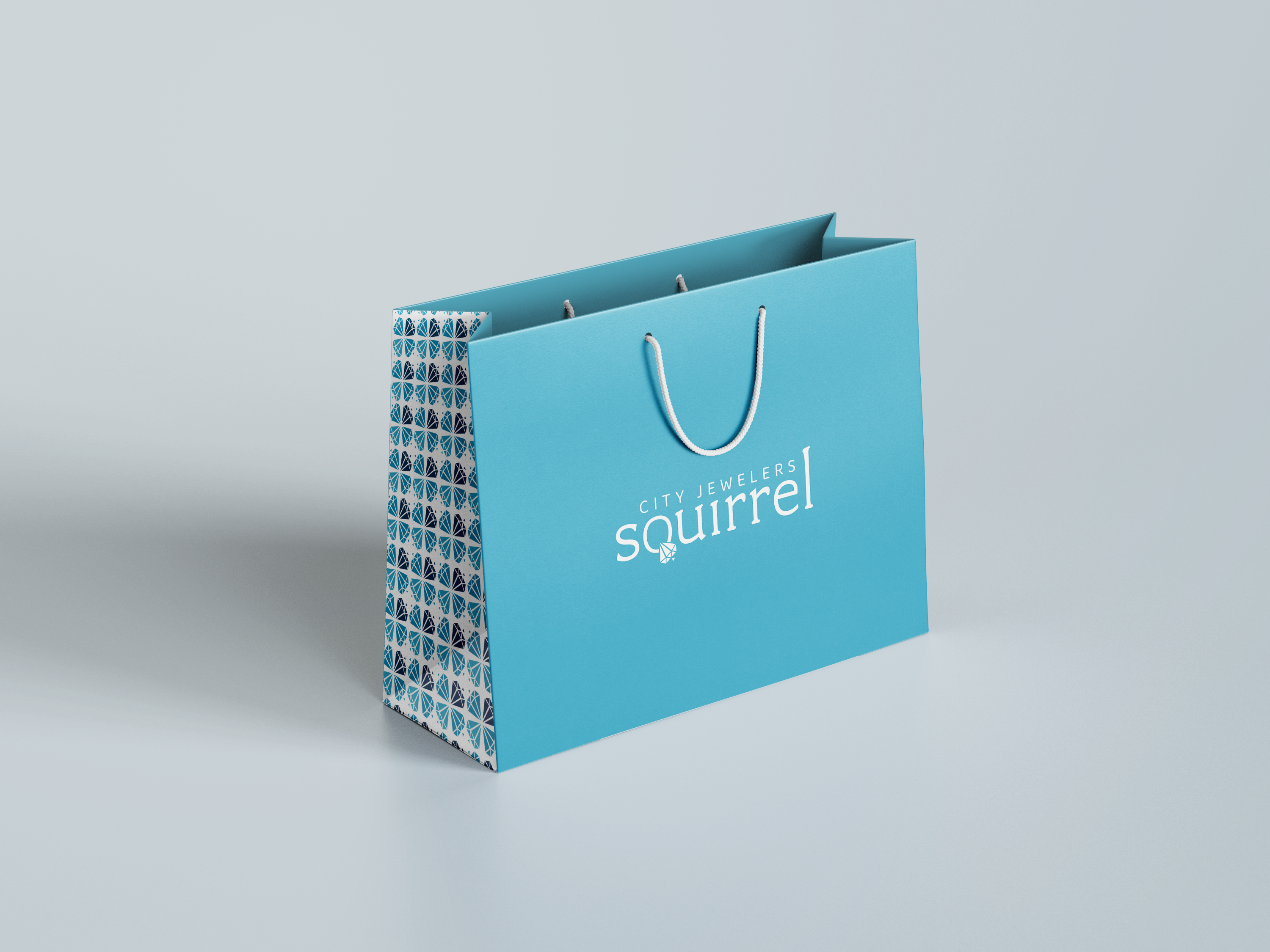
For Squirrel City Jewelers, I created a brand identity that seamlessly combines sophistication with a personal touch. The design revolves around a thoughtful use of light and dark blue tones, evoking feelings of trust, luxury, and timeless elegance. A standout feature of the logo is the “Q” in “Squirrel,” reimagined as a diamond ring—a subtle yet striking element that instantly communicates the brand’s focus on fine jewelry. The typography and color palette work in harmony to craft a visual identity that feels both refined and approachable, with a nod to the local community spirit. This brand identity not only elevates the perception of the jewelry but also connects with customers on an emotional level, making it a standout presence in the market.